

Quick update: The Cover is Complete
Quick update: The Cover is Complete
The book is taking form

EDIT: The first photo came from Pexels and the second photo came from designing a cover using a Freepik photo. This is why there so much differentiation between the presence of the photos!
Hi guys!
A huge thank you to everyone who voted on the cover! I was very surprised to learn that a lot of people had opinions on the cover. Specifically, negative ones. Of the covers that I created, the one that got the most positivity was #2.
I use the word “positivity” lightly, however, as the reaction was lukewarm at best. Most people voted for “None of the above” on the form! I’ve got no experience in designing book covers what-so-ever, so I wasn’t surprised. However, I had to restart from somewhere, right? After some feedback, I created a cover that factored in the most preferred image but also addressed the biggest concerns, which were:
It had no colour
It was dreary
It looked like a dieting book
The cover was too messy
It looked liked a recipe book
As always, brutally honest feedback is the absolute best thing to help push my book to its best version. With those comments in mind, I took another stab at it! Take a look:
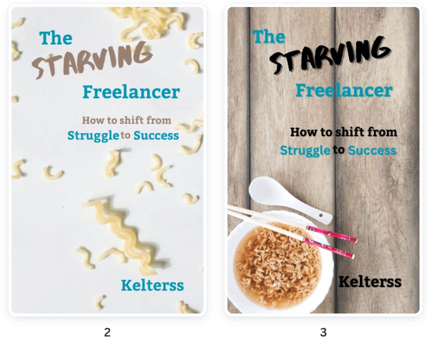
It looks like a real book now
My thoughts on it, which are obviously biased, are that it now looks like an official book. Is this the best cover in the world? No. But, it’s the best that I can do with the very limited skills that I have. That’s what counts!
What now?
So far it’s gone through 5 rounds of edits and I just finished proofreading it for grammar, word flubs, etc. Now it’s onto its final read-through and then I’ll start formatting! Once that is done, I’ll have an official release date that I can share with you all!
Are you excited yet?
Thoughts? Concerns? Complaints? Let me know by leaving a comment or emailing me directly at kelterssbw@gmail.com.
I like the new cover. The images give it depth and style. But I'm concerned that the word "Freelancer" is a bit obscured by the shadow in the vertical seam of the board.